We remodeled our own personal kitchen on a below-average budget ($119/sqft) using IKEA cabinets and Walnut Studiolo leather drawer pulls and handles.
During the process, we learned that a few big design compromises kept us on budget and schedule, while freeing us up to splurge on a few important design details that are now our favorite features! We also share a few tips we learned to make DIY kitchen planning easier. All in all, we managed to come in under budget and on schedule thanks to careful planning and a willingness to compromise. This is what we did:
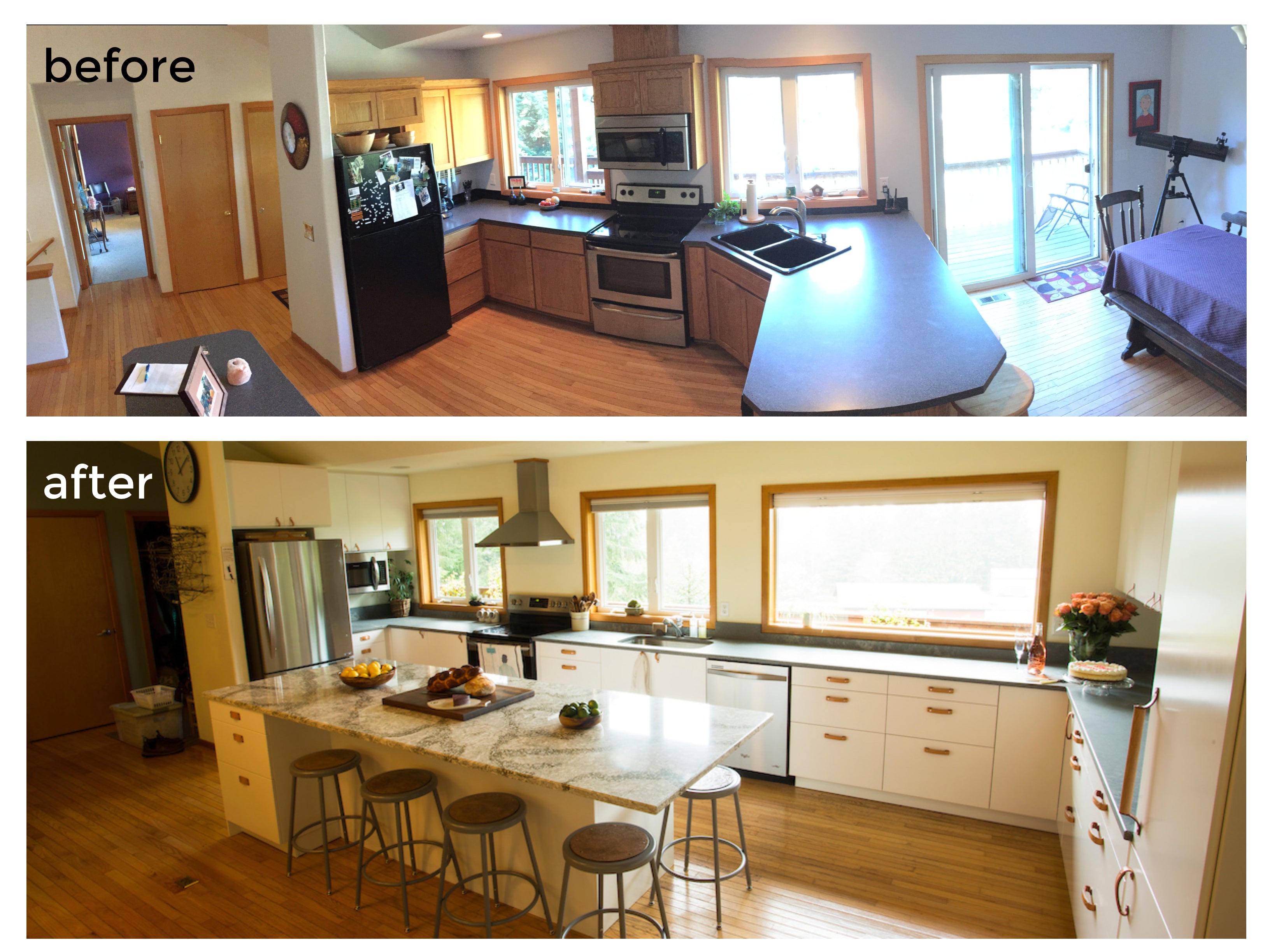
Before
Before we moved in, the kitchen was not only not to our taste (90's oak cabinetry, black formica countertops, black sink), it just wasn't functional. Two people couldn't cook together without bumping into each other, and there wasn't enough storage. The eating area in front of the sliding glass door never got used.
We *love* to cook, and since we work from home out in the country, we only go out to eat maybe one meal a week. Kitchen functionality is pretty important to our daily lives, so we decided to do a complete overhaul of the kitchen.

After living with the house a couple years, we decided to extend the kitchen all the way along the window wall, which meant taking out the sliding glass door and putting in a picture window.


Expanding the full length of the wall would add a ton of storage, allow for an in-kitchen eating area, and frame the kitchen around the beautiful mountain views outside the window. But this made the kitchen MUCH bigger, and we didn't have a lot of money to spend on the remodel.
Stay Under Budget with Big Design Compromises
Living with the space for a couple years really helped us think long and hard about our design. Since we were on such a budget for such a large area, we knew we had to make some compromises, right at the get-go:
- Right away, we knew we had to go with IKEA cabinets and doors. You just can't beat the quality for the price. We found a contractor-friend who let us assemble the cabinets ourselves to save on costs.
- We made an early decision on a color / focus theme - it made so many decisions later on so much easier. In kitchens, inexpensive usually means a white/chrome, and for our kitchen that worked out perfectly. The white cabinetry "disappears" when you look through the kitchen to the window view outside, turning what might have been seen as a disadvantage into an advantage for our space. A white kitchen is the perfect compliment to the beautiful mountain view windows.
- The next, huge compromise we made was to agree to use our existing major appliances in their existing locations. No changing around of electricity or plumbing saved money and time.
- Countertops can take up a surprisingly large portion of the budget. We were willing to consider going industrial if we needed to, to save on costs. But, in our rural area, it turned out that Quartz countertops cost the same as Formica, so we got a mid-range countertop for the lowest possible cost.
- Be willing to shelve or modify projects when an unwelcome remodeling surprise turns up (there's always something!). We had planned to modernize the ceiling lighting, but mid-construction it was discovered that we would have to remove the entire ceiling in order to reach the wiring in our narrow parallel chord truss attic space. Rather than blow the schedule and our budget by 25% or more, we simply accepted it and moved on. We know that it will need new lighting someday, but that project was not in the cards this go-around.

Splurge on the Details to Make it Beautiful
Kitchens get expensive fast, and if you try to make everything perfect, the budget will quickly careen out of control. But on the other hand, nobody wants to remodel a space and have it look cheap. Luckily, you don't have to. By making big compromises on the big ticket items, you can leave more space in the budget to splurge on the beautiful and fun details.
- Door and drawer faces are a popular detail to splurge with IKEA kitchens. There are lots of companies offering aftermarket alternatives to IKEA's door and drawer faces (like Semihandmade) - we loved them, but for our simple white kitchen, the additional cost just couldn't be justified.
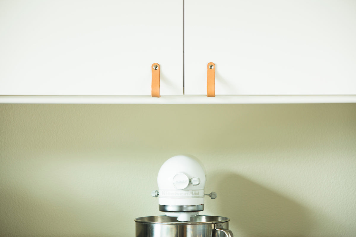
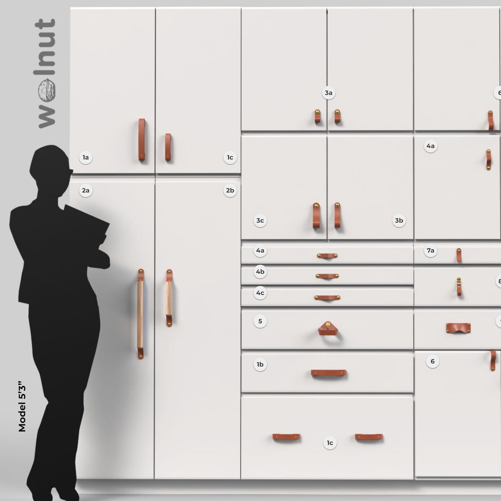
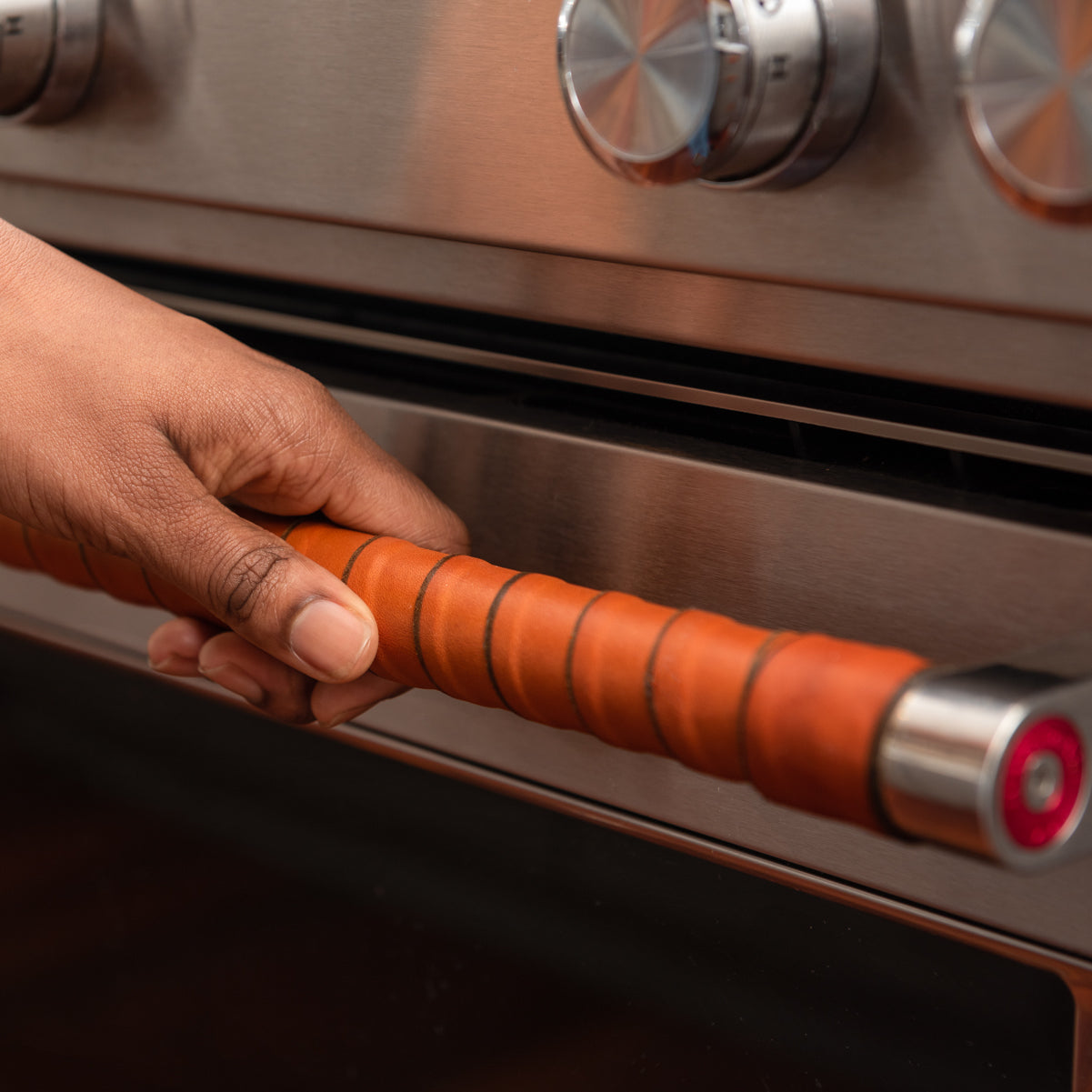
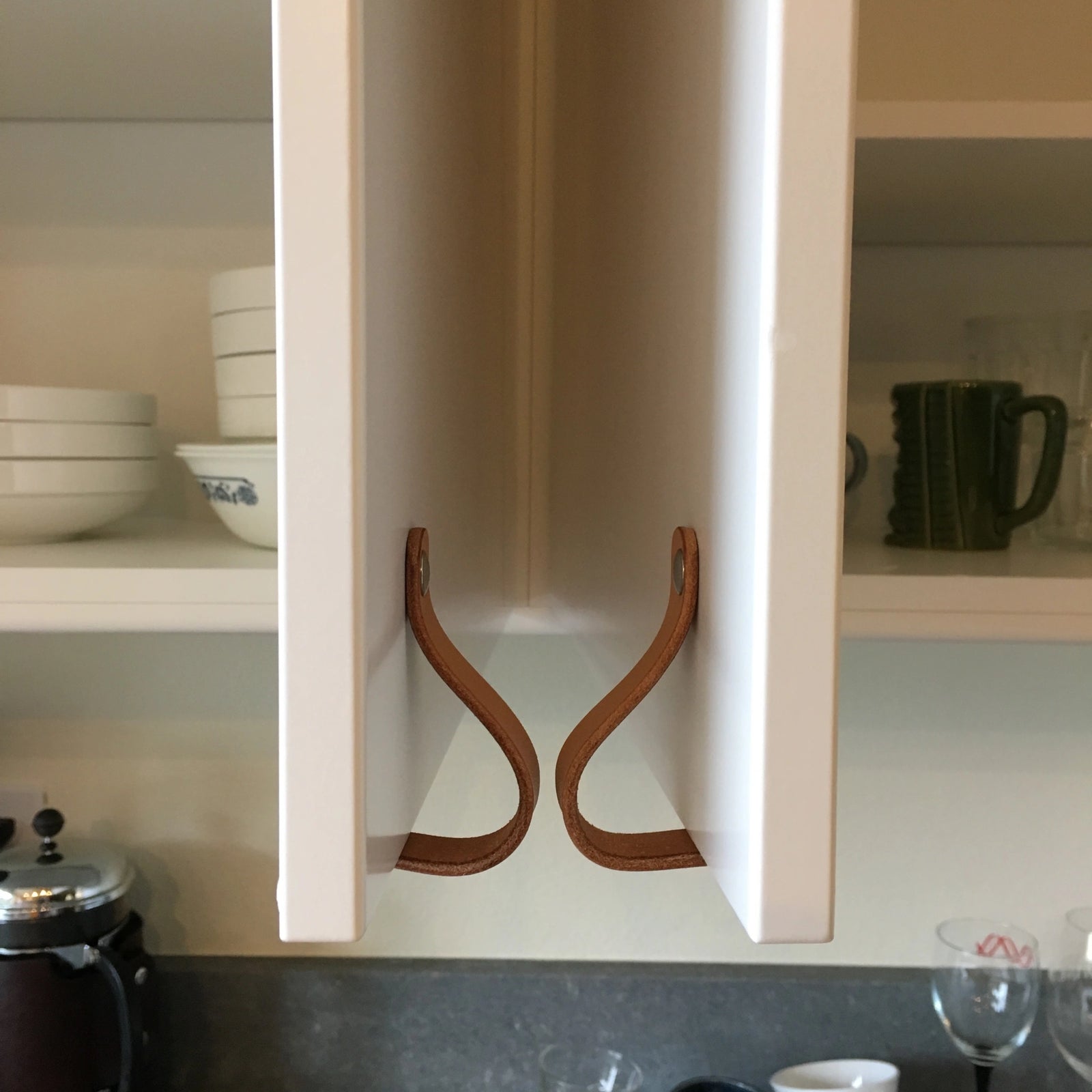
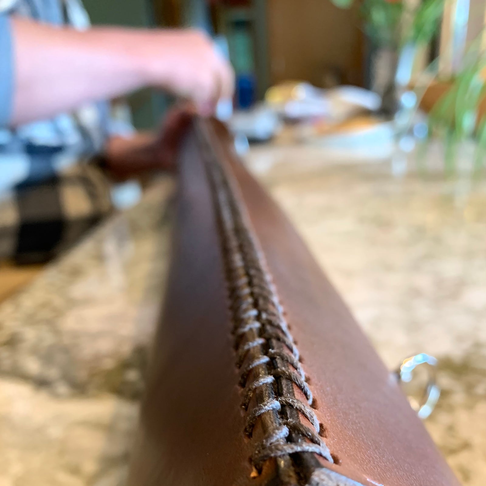
- The handles! Nowhere else in the budget does it make more sense to splurge. Upgrading the handles made the IKEA door same-ness virtually disappear. They're one of the first details most people notice and IKEA's handles are so generic that it's usually a dead giveaway. The handle is the point of connection, where your hand physically touches your kitchen daily, whether it's to get a glass of water or unload the pantry. A warm material like leather feels good in the hand, but it also humanizes and naturalizes the look, contrasting with the modern materials beautifully.

- For our kitchen design, the island became the centerpiece and the hang-out area, so we knew we wanted something special for the island. We saved costs with a neutral, inexpensive concrete-effect gray quartz countertop that shaped the kitchen like a "U" but we splashed out with a Cambria natural, veined quartz for the island centerpiece. The size of the slab (10ft) determined the size of our island, so we designed our island to the countertop, rather than vice-versa, making use of every square inch of the material we bought. This decreased the cost per square foot and decreased waste material.

Things We Wish We'd Known: DIY Kitchen Planning
We learned - and re-learned! - a few tricks of the trade when designing the kitchen. Hopefully these tips will make your lives easier during your remodel:
- If using IKEA, use their kitchen planner at home before you go into the store. This will bring up all kinds of questions, because the program has limitations that make you question things. You may have to go into the store more than once to talk to an associate during the design phase, before you're ready to pull the trigger. We found it was helpful to go first thing in the morning, right when they opened. And be prepared to be patient, both with the program and in-store.
- It can be really hard to pick out the right cabinet interior fittings from the kitchen model (shelves vs drawers, high vs low, etc). We spent a lot of time making a list of every kitchen area/drawer we currently had, and then labeling it on a printout of our IKEA kitchen model to make everything had a place. In the end, we found out it didn't matter too much - with IKEA cabinets you can switch out the interiors after cabinet installation, which we did a couple times.
- Commercial kitchen designers have already figured out the best rules of thumb for perfectly efficient function, so you don't have to reinvent the wheel. Consider the kitchen a food assembly line, from raw material to finished product exiting to the dining area. To help guide spacing and placement, use the commercial kitchen rules of thumb - and then break the rules if you don't like them!
- 4 ft is the standard aisle-way width
- 30' is the standard height for the hood range above the stove - Inset microwaves are as expensive as ovens, but cabinet mount microwaves are cheap. We installed a cabinet mount microwave in a dark corner, where it's mostly out of sight but still functions like a wall appliance. A little unorthodox, but 6 months into it, this is one of our favorite design decisions!

About Walnut Studiolo
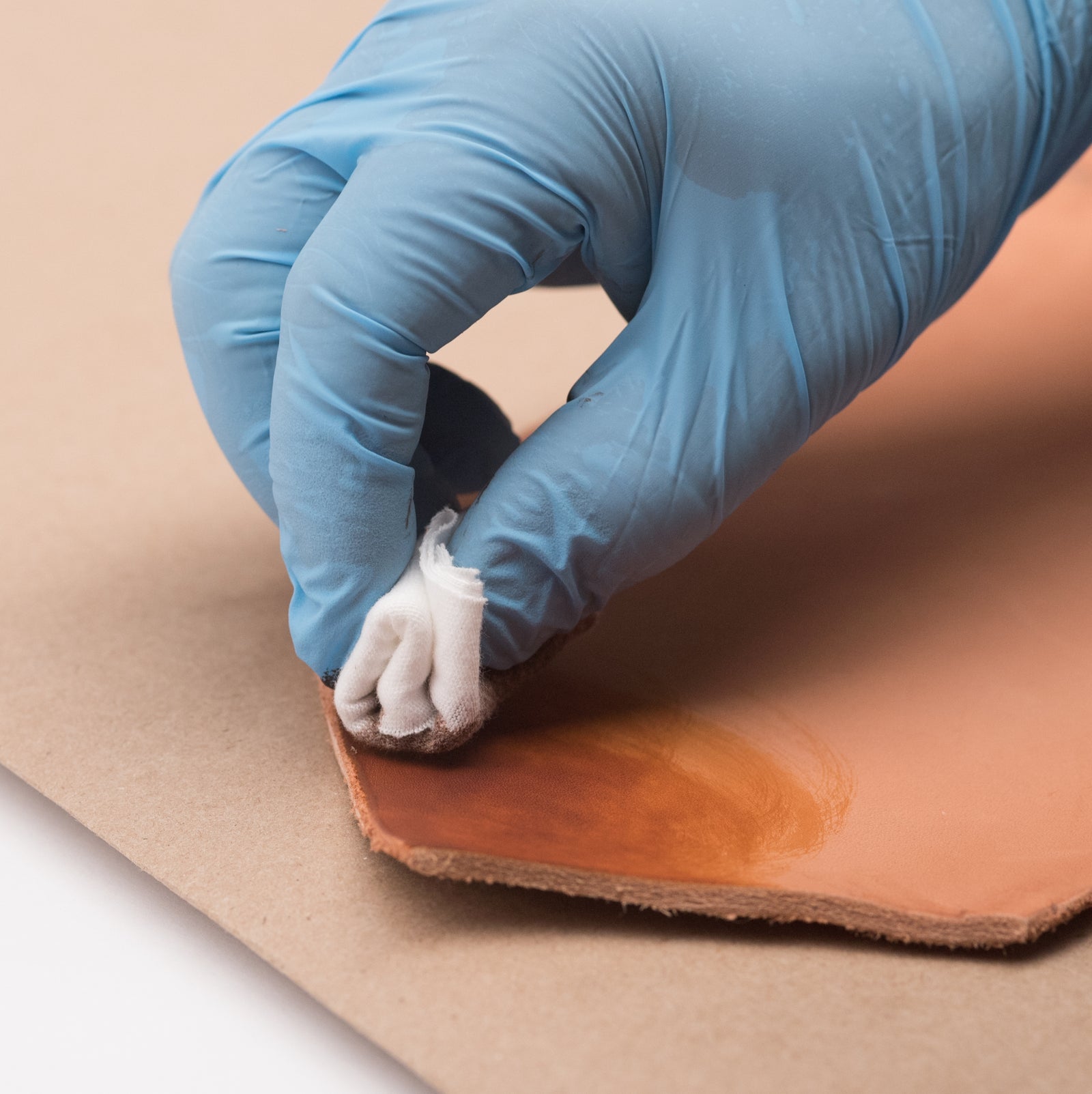
Walnut Studiolo crafts original modern designs by hand in our Oregon workshop using only natural materials. We make all the leather drawer pulls and handles seen here. Handcrafted in Oregon out of the finest vegetable-tanned leather and sustainable woods, our leather drawer pulls and cabinet pulls make fine accents to any kitchen, home, or dresser drawers.
Get inspired with our drawer pull project photo galleries.
Get the details (specs, stylesheets, etc) on our drawer pull info page.

















Leave a comment (all fields required)